
Eureka SurveysWorking @ a Startup —
Surveys that pay cash
Eureka Surveys is a native app and web application. It is currently the #1 survey-taking app in the iOS app store with 100K+ Reviews, 4.8 Stars. It provides daily surveys to users who earn cash and sweepstake entries in return. I was responsible of the agile end-to-end processes from conducting user research to launching new features & updates.
Check it out


Role Lead designer
Team Binxin Xie (Design, Columbia), Troy Feng (Tech, Yale), Albert Zhong (Finance, Princeton), Tommy Fang (CEO, Stanford), Kirby Gee (CEO, Stanford)
Duration 4 months (Sept - Dec 2020)
Tool Figma, Adobe Creative Suite, Notion, Miro, Mixpanel, LogRocket

What is Eureka Surveys?1. Sign up through Web
For security issues, users would have to sign up through web to login their app. Because this was a cash app, there were numerous sensitive edge cases to think about.

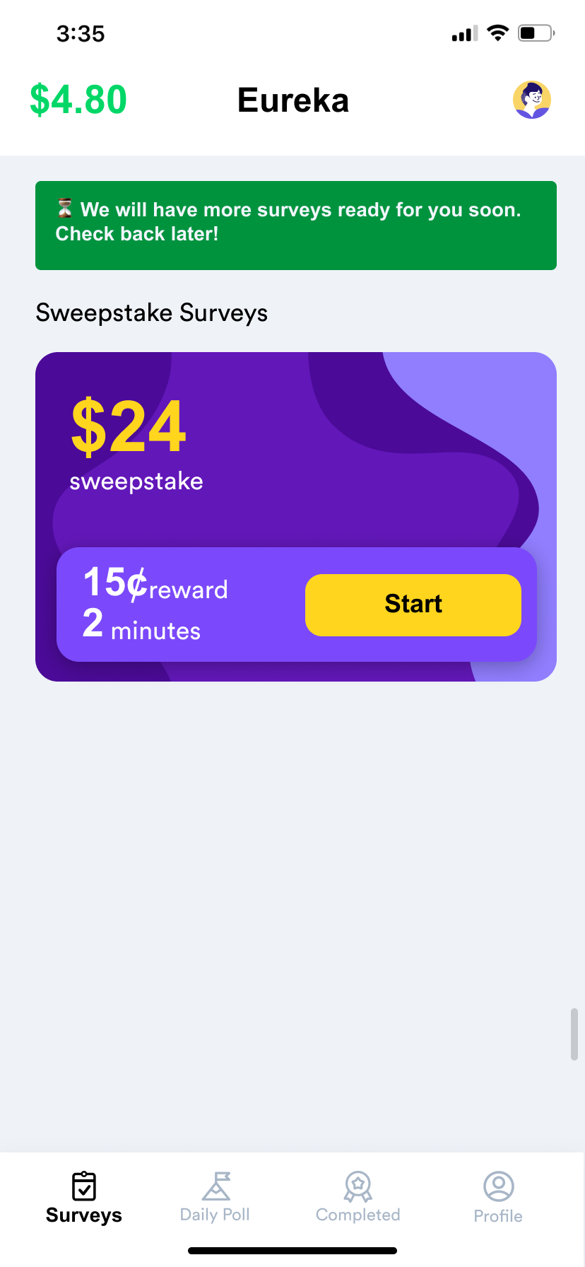
2. Complete Different Types of Surveys
(1) Quick survey is used to gather user data and onboard the users.
(2)This prepares users to take sweepstake surveys which are the ones that generate revenue.
(3)There are also daily polls for a penny 💰
We added micro-interactions and gamification aspects.

#1: Quick Survey

#2: Sweepstake Survey

#3: Daily Poll
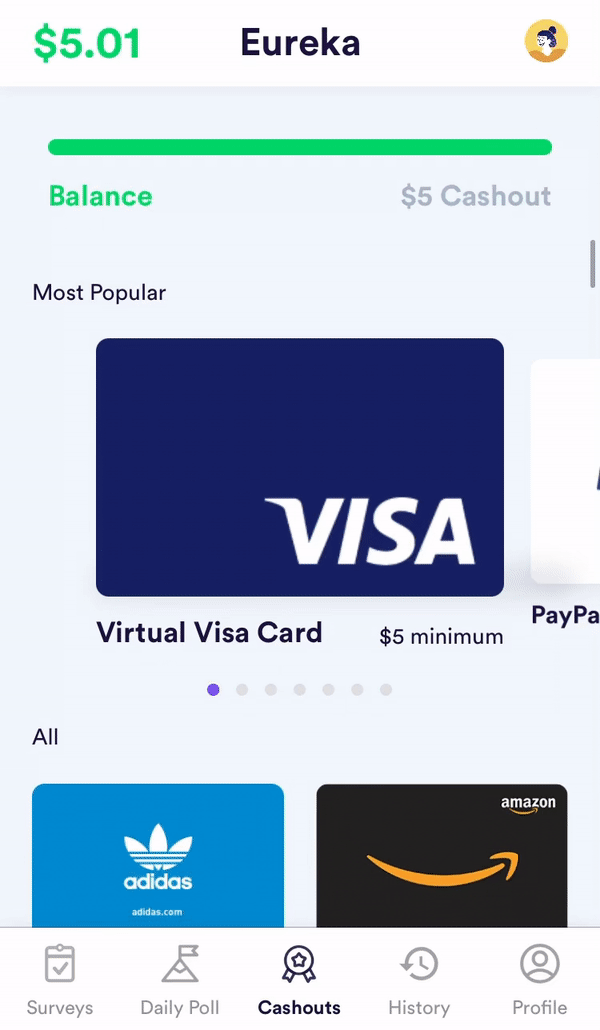
3. Claim and Cash-out!
Done enough surveys? You can cash out to either PayPal or gift cards when your balance exceeds $5.


Edge Cases and SolutionsAs a lead product designer for a small, fast-paced startup, my role spanned across of range of tasks, including but not limited to:
- designing screens for iOS + responsive web
- conducting interviews and user testing with current users
- analyzing research (i.e. competitor studies)
- ideating new functionalities
- designing the user flow / screens for clients (survey providers)
- designing miscellaneous pages (i.e. FAQ, landing page, terms and policy, blog etc) for SEO purposes.


From the numerous problems we have dealt with, I will introduce you to two ✌️ edge cases we have worked with.
Edge Case 1: Unexpected Device Sizes
How could we present our interface to the users with unconventional devices?
When we monitored user behavior using LogRocket, we discovered that majority of our web users were using small, vertical android tablets instead of traditional desktop devices. This caused problems because our breakpoint for the responsive web was set to a smaller number.
We re-examined our breakpoint and designed the offer wall as a sliding page when the device ratio was < 1:2.

We made sure that the responsive design did not have problems of having squeezed column display, illegible letters, unclear CTA buttons.

Edge Case 2: Unexpected Survey States
How do we stop losing user engagement when there are technical interruptions?
Interruption 1: Survey terminated
A lot of our surveys are conducted on a third party platform. This is the major reason why the completion rate of sweepstake survey could sometimes be as low as 5%.
In order to encourage users to come back, we implemented "rewards for terminated" concept, where we presented partial rewards to the users even after their survey was terminated by the third party platform.


Interruption 2: Low quantity of surveys
Survey supply is seasonal and the quantity/ reward amount could be affected by multiple factors. When there's no survey on the home page, or when there are days when surveys are paid better, we decided to be transparent as possible through the use of banners.

Interruption 3: Combat delayed loading
We noticed users are rage-clicking on the Sign-Up button on the landing page even thought we presented a loading modal. To prevent rage-clicking, we grayed out the CTA button, and relocated the spinning animation on top of the button. This gives a much clearer direction that the CTA button is not clickable.

What I learned
I'd like to thank my team for being amazingly smart and fast-moving people. This was a lifetime opportunity to work at the early stage of a successful startup in such a fast-paced and virtual environment. I've learned so much — not only about rapid prototyping and creating clean UI, but also about how business runs.