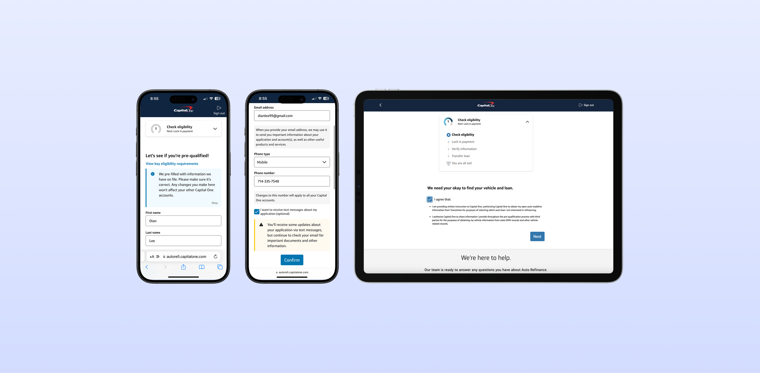
This is a redesign of Capital One’s auto loan refinance pre-qualification experience.
Impact —
+ 7.2% lift in Sign-in to Submit application rate
+ 4.7% lift in Sign-in to Contract rate
Role Lead designer
Duration 5 months (Q4‘21 - Q1‘22)
Tool Figma
ⓘ HOW AUTO REFINANCE WORKSPROBLEMAlthough mobile traffic nearly doubled that of desktop, mobile users completed pre-qualification at lower rates than desktop users.
The current mobile pre-qualification experience was overwhelming and tedious due to cognitive overload. Users had to input all info on a single page with a lack of information hierarchy.
I decided to revamp the experience into granular steps. Although more clicks often mean more “physical” cost, in this case, it meant removing “mental” cost.
SOLUTION AND IMPACTAfter collaboration with design, legal, tech, and product teams, I was able to break down pre-qualification into a modular experience. A/B testing was performed on 50% of users randomly selected via Adobe Target. My designs led to 7.2% lift in application submission rate and became the new control for both mobile and desktop.
Contact me to learn more details about the design process or…


