
GuardianA university emergency response app for you and your friends to keep safe

Numerous man-made emergencies such as robbery, bullying, and sexual harassment continue to occur during college. However, university students tend to be unprepared and struggle to take action when they face emergencies. During these stressful circumstances, students need imminent support - both instrumental and emotional. Guardian is a university emergency response app that will help students throughout all stages of an emergency.
Role Product Designer
Team Irene Yu(Visual), Wendy Chang(Research)
Duration 3 weeks (team) + 2 weeks (personal)
Tool Figma, Photoshop


NOVEMBER 19, 2019. IT WAS A NORMAL TUESDAY MORNING.Like any other day, I looked for my laptop in the living room as soon as I woke up. But it was gone - stolen from my own dorm living room! 😱 I panicked and frantically looked around the whole dorm, not knowing what to do. I was stressed and my head went blank. I had no idea what to do nor of any emergency response system.
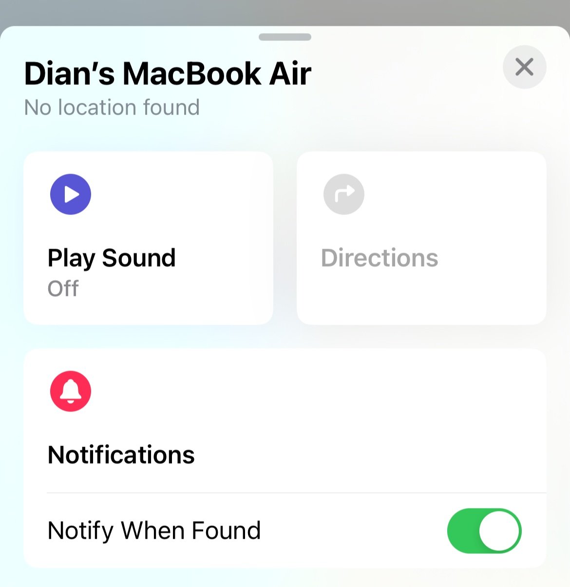
To this day (2024), my Macbook Air lives in my 'Find My' app...SECONDARY RESEARCH
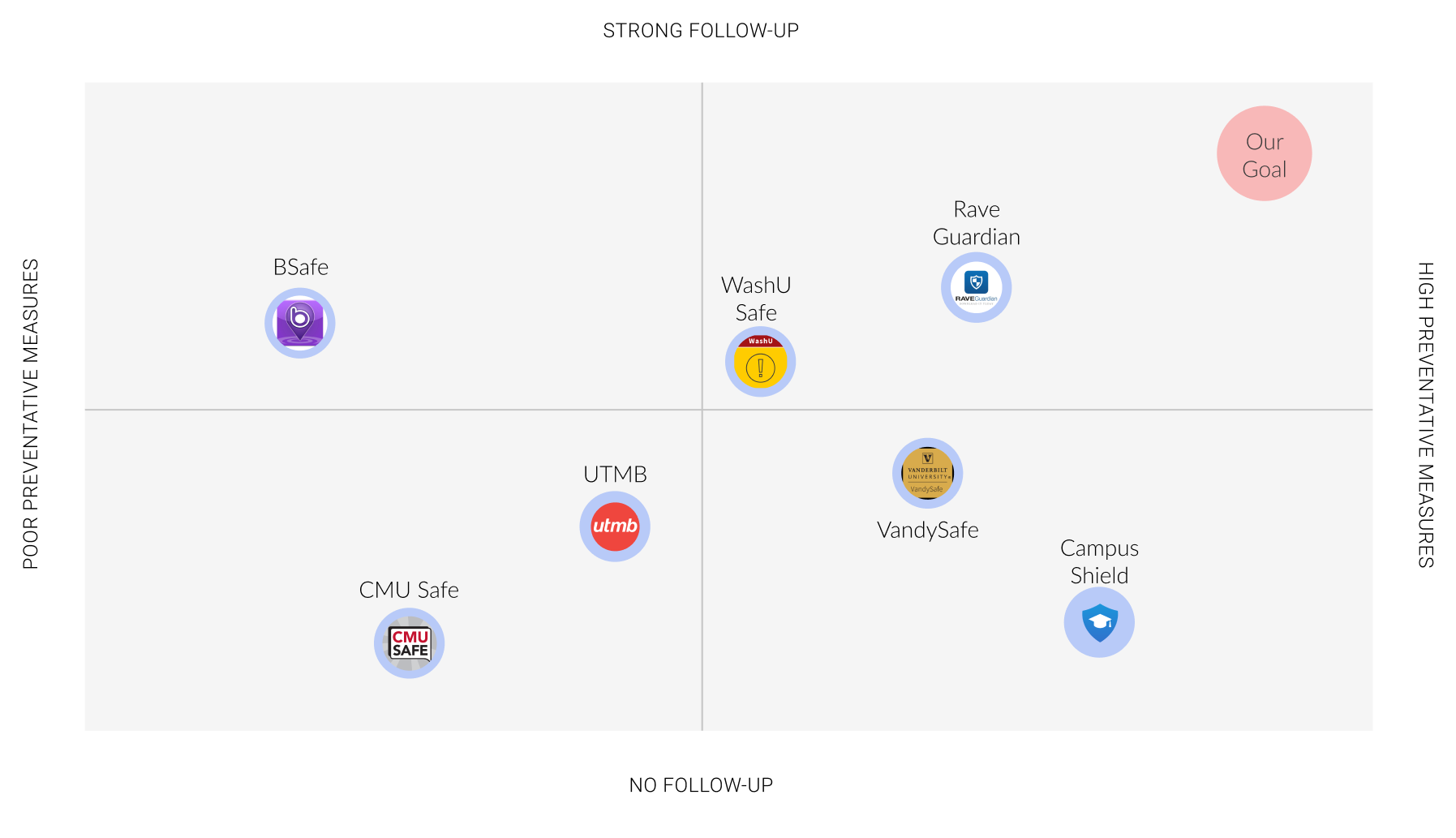
There apparently was one; I just didn’t know about it. Thus, our team began research in emergency response at universities from online secondary sources and conducted a competitive analysis. We found that most of the current system lacks information hierarchy resulting in difficult navigation and information search. The systems also only generated unsympathetic email notifications.
INTERVIEWS
As university students ourselves, we further readily executed semi-structured interviews with our stakeholders including students and campus police. Unsurprisingly, 9/10 students did not know about the emergency response website, and 10/10 students responded that calling the police was the only emergency response that they knew of.

USER JOURNEY MAPS / PERSONAS
One of the important components that we also found was that there seemed to be no emotional support for the students from the current emergency response systems. Although emergencies are very stressful situations, as highlighted in the student journey map, follow-ups were very formal and impassive.
The personas that we identified for each of our stakeholders [student, CMU PD, and university chief risk officer] also indicated that students were not trained about preventative measures.
INSIGHTS
Our research yielded 3 main insights that guided our design decisions.

IDEATION: USER TESTING WITH STORYBOARDS
To understand what solution would be optimal for students, we conducted speed-dating sessions of 6 different scenarios with 5 university students. We tackled problems such as optimism bias or lack of access to follow-ups. Students specifically pointed out that they prefer getting emotional support from real people (i.e. family and friends) more than anything.


Many also mentioned that walking alone late at night was scary, and that between friends, it was very common for them to share locations on the iPhone’s Find My Friends app. I myself, actually use this feature.

Find My Friends, a mobile phone tracking app developed by AppleSITE MAP
I decided that the app needs to provide different levels of responses for all stages of an emergency: crucial (during an emergency), secondary (before an emergency; preventative), and follow-up (after an emergency).

DESIGN SYSTEM
I specifically used the Homeland Security Advisory System’s color code for risk levels. It is crucial that the users understand the severity of risks intuitively, and this was possible through the use of colors.

SOLUTIONGuardian: A university ER app that gives instrumental and emotional support during all stages of an emergency.
Effective onboarding
During the onboarding process, students can sign up with their school account. This allows the user to be more involved as a community as well as have easier access to the services provided by the school. A short tutorial of how to use the app is also provided.
View and report crime alerts
A heat map distributes the severity of risks through colors. This can be done through crowdsourcing and data collection of past crime locations. Users will be immediately notified of the specifics through crime alerts, easily accessible at the top of the screen.
Users are also allowed to report incidents when they see suspicious activity, which the police will quickly review. Calling 911 is also an immediate action item users can reach.
Take action with the Safety Kit
Users can swipe left to access the safety kit, which allows them to easily search up actions to take after an emergency occurs.
Walk safely with a Chaperone
Let’s say you are in the “severe risk” zone. If you feel unsafe, you can quickly call a chaperone to walk with (service provided by school which students are mostly unaware about!).
Share with your friends
Within Guardian, I incorporated a social aspect so that users can get emotional support from a selected group of real people as well as to simply increase the awareness of the ER system among university students. Users can send friend requests, share locations, call, and see each others’ safety status.

Quick alert and contact
I also designed for a wearable, a smartwatch, which would allow users to quickly receive crime alerts and contact friends on Guardian.
EVALUATION: THINK-ALOUD PROTOCOLS
To ensure that the app is understandable and easily usable, I conducted think-aloud protocols with 3 university students. Feedback consisted of:
1. The interactions and colors were intuitive so that the user could easily take action during an emergency
2. The social aspect (i.e.sharing location) would bring the students to use the app
3. It could be used for not only university students but a wider audience.

Speed-dating with storyboards
Think-Aloud for user testingConcluding thoughtsTwo things I focused on in this project —
Micro-interactions to create an intuitive experience.
Leveraging the power of social influence to prompt users to actively engage in preventative safety measures.
Guardian was a very relatable project that I learned and enjoyed a lot. I’d love to further work on future projects that I myself am the user of.